The art of perfecting a logo
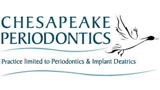
A couple months ago I had the opportunity to design a logo for Chesapeake Periodontics, who was a client of Emerging Communications. At the beginning of the design process, I was told that the client liked ducks and the outdoors so I went with that as the inspiration for the logo.
Here are some of the initial proofs I came up with that led to the final logo design.
In the end, the client decided they wanted to try something else in place of ducks so I did a typographic illustration of the initials of the company to look like a sail boat, representing the Annapolis location.
After the logo was designed, I carried out elements of the logo onto the rest of the branding and identity materials including letterhead, business card, brochure, and envelope.


OMG THIS IS SOOO COOL!!! I ESPECIALLY LOVE THE LAST PIECE!!
Thanks, glad you like them!! The last was the end result.